Uncommon Grounds Rebrand - Case Study
Objective
Rebrand a high-end coffeehouse with your group and each create a new logo design. Using the new logo, create the following package designs: K-cup coffee box, coffee cup, coaster, and gift bag.
Coffeehouse: Uncommon Grounds
Planning and Researching the Coffeehouse
The Coffeehouse that my group and I were assigned to rebrand was Uncommon Grounds. Uncommon Grounds is an Internet cafe located in Downtown Burlington, Vermont. The target market for the cafe was college students and hipsters, with an eco-friendly/earthy mood and vibe. Keeping this in mind, I sketched out various ideas for my version of a new logo for the coffeehouse. I definitely wanted to include a coffee bean as part of the logo, so in each of my sketches I attempted to make it noticeable. Since UG is an Internet Cafe, with an eco-friendly/earthy mood and vibe, I attempted to make those things noticeable. This was done so in my first, third and fifth sketches. After struggling with making a decision on which logo to choose and continue on with for the design process, I ended up choosing my fifth logo design idea because I liked how simple and clean it looked.
Designing the Logo and Products
I designed the logo in Adobe Illustrator and came up with several different variations. In each one, I tried to show the “internet cafe” part of the coffeehouse with the use of a wifi symbol and an @ sign. Out of the four I designed, I decided to go with the first one since it was simple. I felt that with the wifi symbol, it looked awkward and out of place in the logo. With just the @ sign to still show that it’s an internet cafe, I figured it was a subtle approach and went along with my idea and what I wanted to create.
Logo variations
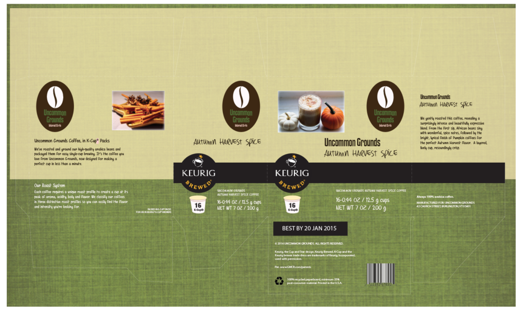
After completing the logo and choosing the one that I liked the best, I started on the k-cup coffee box. I placed the logo in three different spots, the front, the back, and on one of the sides. The k-cup box was modeled after a Starbucks k-cup coffee box that my teacher provided and allowed us to use. With the color palette I chose, I tried to use mostly all the colors to my advantage for my k-cup box. I chose ‘Autumn Harvest Spice’ as my coffee flavor and found two pictures to display that on the front and back of the box. For this project, we needed to create a mood board, and I thought it was very helpful when it came to the design process. For part of my box, I used one of the textures that was used in my group’s mood board behind the light yellow part and changed the transparency of the yellow layer, so you could see the texture.
K-cup coffee box design
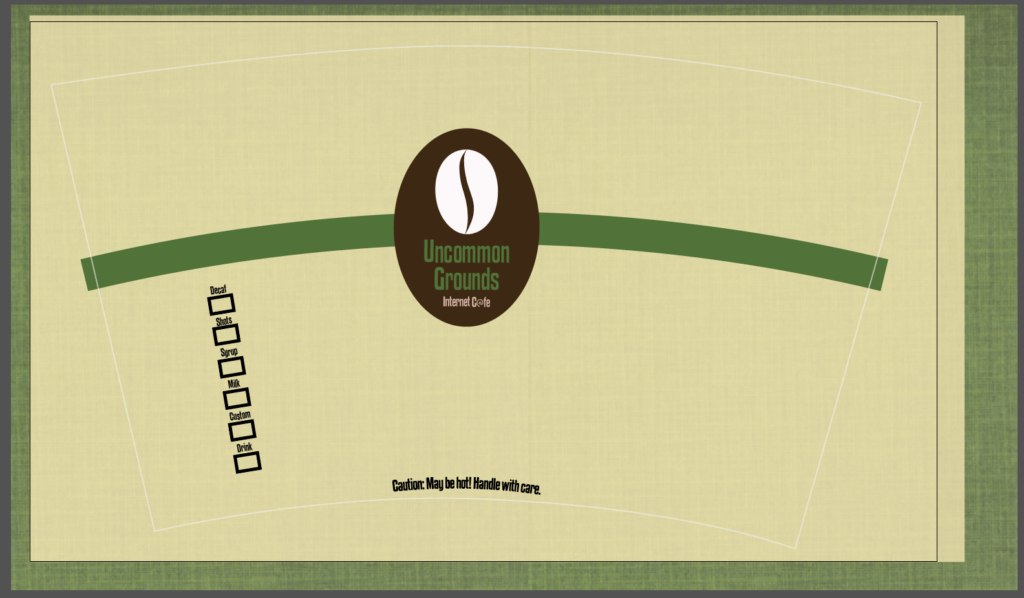
I used the same colors and ideas that I used on my k-cup coffee box, for my coffee cup as well. I placed the logo in the center (sizing it appropriately), and created a green colored band that would be wrapped around the entire cup once it was printed and glued onto a coffee cup. I also listed the different items that you could get in your coffee on the side and each one could be checked off to show which was in your cup. Towards the bottom of it, I added a caution line to explain that the contents inside the cup may be hot.
Coffee cup dieline
Fonts
The fonts that were chosen for this were from my group’s mood board. We had found several different fonts that could be used for each of our packaging designs from 1001 Free Fonts. We chose these fonts (most of them being handwritten) because we wanted them to go along with our theme (college students and hipsters, with an eco-friendly/earthy mood and vibe). Out of all the fonts, I chose to use “Mf Air Balloon”, “DK Early Morning Coffee” and “Kenyan Coffee” as my fonts for my designs. I used “Mf Air Balloon” as the body text on parts of the k-cup box, “DK Early Morning Coffee” for the coffee flavor name, and “Kenyan Coffee” in my logo, k-cup box and coffee cup dieline.
Colors
The color palette chosen for this was also from my group’s mood board. When it was time to find color palettes, we looked on Adobe Color and used the keyword “earthy” to find palettes that went along with our search. We found two different palettes, named “Earthy” and “Green Earthy.” For my package designs, I used the “Earthy” palette since I felt that it had the earthy eco-friendly kind of vibe that I was trying to go for in my package designs.
Final Thoughts
This was the second and final big project that we had in our Package Design class. It took all of November and most of December to complete, and was extremely stressful at times. In the end when it was finally done, I was relieved. It was the first time I ever rebranded a place. Though it was just a school project, I’m glad that I got experience (for myself and from working in a team for most of it) and knowledge from it to use for future rebranding projects.


