Amnesia Lyric Poster - Case Study
Objective
Create a lyric poster for one of your favorite songs. Make typography the focus of the poster.
Planning the Lyric Poster
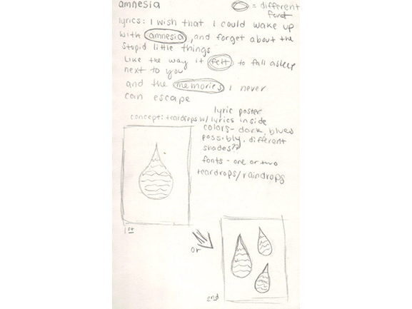
Since the song is kind of sad, I thought the idea of having teardrops (or raindrops, could be viewed either way) with the lyrics inside and using blue colors would explain the sadness appropriately. I sketched out two different versions of the idea, and designed the first one in Adobe Illustrator.
Designing the Lyric Poster
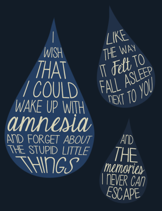
For the first idea, I started to play around with the lyrics off to the side, and used the first line for the one drop. After looking at it for a while, I designed the second idea with three drops to see how it would look. I used the rest of the lyrics and distributed them onto the other two drops. I ended up liking the second idea the best, since it included more of the lyrics and used up more space.
Fonts
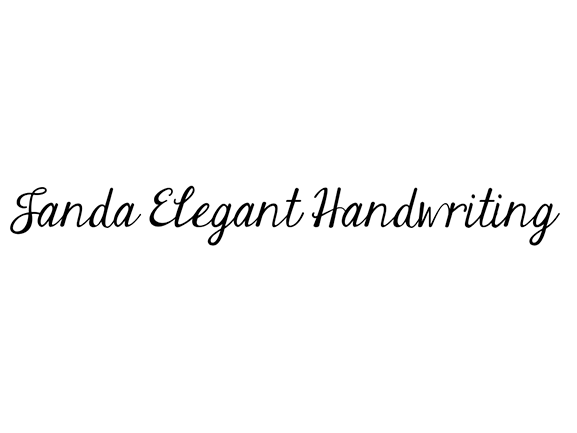
I chose two different fonts for this poster. ‘Give It Your Heart’ was used for most of the lyrics, since I wanted a simple, readable font for it. Out of the few lines of lyrics, I selected “amnesia,” “felt” and “memories” as the main words because of how the lead singer expresses his voice while singing them. For that reason, I decided to use the font ‘Janda Elegant Handwriting’ to make them prominent. I warped/fixed each line of lyrics into the drops to try and fill up the space, and made sure that the three main words of each line were near the middle.
Colors
Whenever I need certain color palettes, my go-to place is Adobe Color. I just type in any word that deals with the project I’m working on and see if anything comes up. For this, I typed in the word “amnesia.” Some color palettes actually came up with the search, which I did not expect at all! I used colors from two different palettes. Off “Amnesia,” I used the first dark blue color as the background color for the poster. The other blue-ish colors that you see as the color of the drops, I actually based off the background color. I opened up the color picker in Illustrator and selected three slightly different shades of it to use for the drops. Off the “drown amnesia” palette, I used the third color as the color of the lyrics since I wanted a somewhat light color for them, so you could read the lyrics off the blue colors without any problems.
Final Thoughts
The poster took me several hours to create, but it was not done in one sitting. I would work on it for a little while, save up, and then leave it alone and come back to it the next day. In my opinion, you shouldn’t spend so many hours on a project in one day. You should take breaks in between, or finish up for the day to give your brain a break, come back the next day to continue with a rested mind and possibly some new ideas.
Overall, the poster was really fun to create and design. Music is one of my favorite things, so I really like including it in my designs. Something that helps me along with the process of creating them is listening to the song on repeat.


