Skellington’s Pasta Box - Case Study
Objective
Design a unique pasta box that can hold 1 lb. of pasta. Typography will be the main graphic element for the package design. Your packaging should contain a photograph of the pasta and a die-cut shape that would allow the pasta to show through the box.
Planning for the Pasta Box
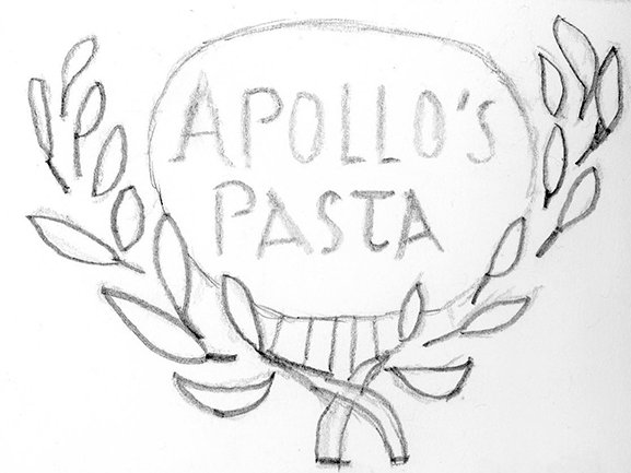
When I started this project, I had a little trouble figuring out exactly what I wanted to create. I started to brainstorm my ideas into different sections: words, names, and possible names. With each word I brainstormed, the goal was to try and come up with as many different names I could think of using the words I provided. Once I felt like I had enough possible names, I chose three of them and started to sketch out logo ideas.
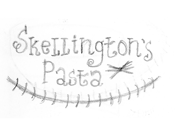
Using the ‘possible names’ list I created, I chose Skellington’s Pasta, Dark Moon Pasta, and Apollo’s Pasta as my final three. I was happy with the names I chose, and decided to use the word “pasta” after each one. With my three chosen names, I sketched out three different logo ideas and from there, picked my favorite to continue the design process.
I ended up choosing Skellington’s Pasta as my name for my pasta box. I wanted to use this name because it was my favorite and inspired by ‘The Nightmare Before Christmas’, which is one of my favorite movies. With this in mind, I started to sketch out some ideas for what I wanted my box to look like. On the first sketch, I sketched the logo at the top of the box, and wrote “halloween shaped” below it. I found Halloween shaped pasta while I was at Christmas Tree Shops one day and knew that it had to be used for this.
For my die-cut, I wanted to use a bat shape to go along with the Halloween theme, and also because Jack has a bat bowtie on his neck. I also included little bone drawings at each of the corners that would soon turn into illustrations. On my second sketch, I also included the logo at the top, but this time had the bat below it as a drawing (soon to be an illustration), and Jack’s mouth as the die cut with a “Halloween shaped” banner right below it. Out of both ideas, I liked the first one the best and started the next step, which was designing in Adobe Illustrator.
Designing the Pasta Box
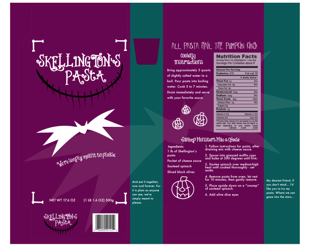
Once in Illustrator, I was able to successfully create my ideas into illustrations for my pasta box. On the front, I followed my first sketch idea for the front cover. I added the tagline “We’re simply meant to please,” inspired by Jack and Sally’s “We’re simply meant to be” (also suggested by my teacher to use) from the Finale/Reprise song in the movie and placed it below the bat die cut. Towards the bottom, I added how much pasta would be inside the box and it’s weight, while on the bottom flap, added the logo again and a barcode.
Again inspired by the Finale/Reprise song, I took some of the lyrics and changed them to go along with the pasta brand, adding them to the sides of the box. On the back, I created little pumpkin illustrations inspired from the original pasta label off the Halloween shaped pasta that I bought from the store. I also created another little tagline (again inspired by the movie), re-created the Nutrition Facts label from the Halloween shaped pasta label, cooking instructions, and found a pasta recipe to go along with Skellington’s Pasta.
First idea of Skellington’s Pasta.
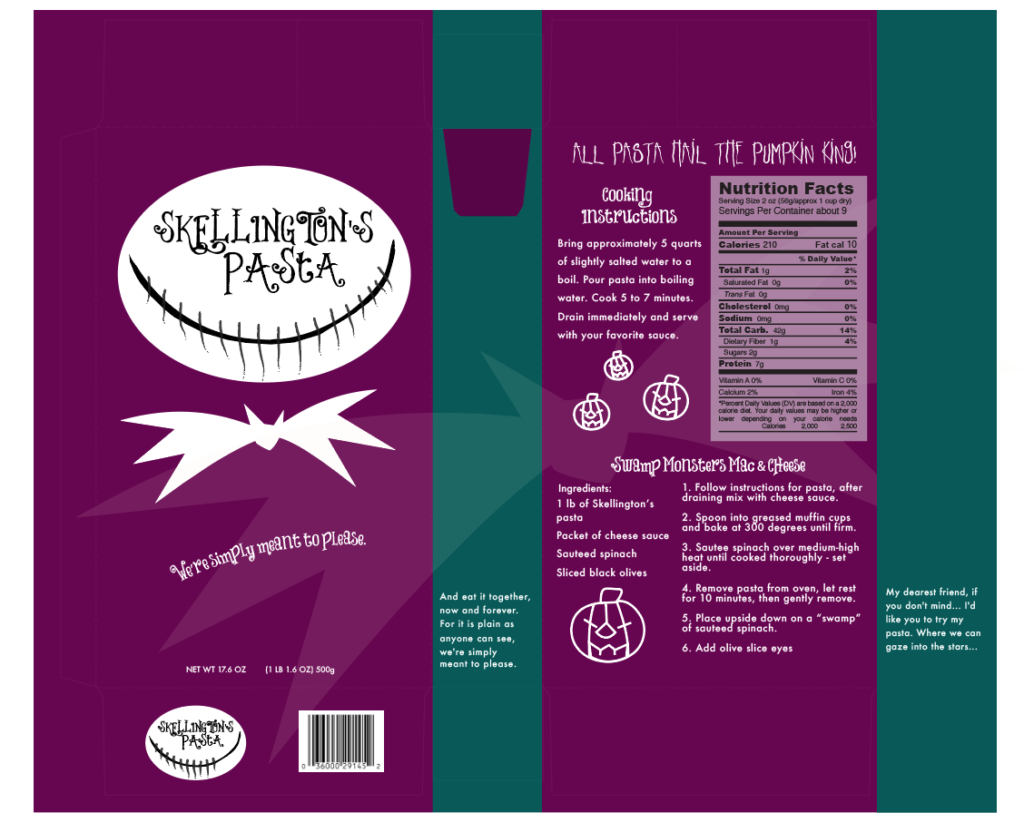
This piece was presented to my class as a part of my portfolio content in my Associate Portfolio class, and it was suggested that I add more of Jack’s face onto the box. I went back into Illustrator and modified the logo and box. The main thing that I thought of to bring more of Jack’s face onto the box was adding the actual shape of his face. I created a white circle, and placed the mouth part that I created towards the bottom of it.
Since the text was originally white, I changed it to black so you would be able to read it. I also moved the bat die cut shape below his head to make it look like more of his body. After looking at all the changes I made, I realized that the little bone borders were not really necessary anymore since they kind of took away from the new look of the logo. Once I finished making all my changes to the box, I reprinted, assembled, and photographed the new version.
Second idea of Skellington’s Pasta after suggestions were made.
Fonts
Choosing the fonts for Skellington’s Pasta was one of my favorite parts for this project. I went to dafont to find two fonts to use for the box. Since I didn’t want to use the same font used on The Nightmare Before Christmas, I found a font almost similar to it, called “Things We Said.” I used it for the logo, the tagline on the front of the box, cooking instructions, and title of the pasta recipe. For the tagline on the back of the box, I wanted to use a more horror-like font for the theme, and found “Lakeshore Drive.” For the rest of the text on the pasta box, I used the sans-serif font “Futura” that was already installed on my computer.
Colors
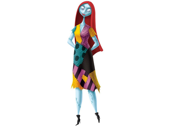
This was also another one of my favorite parts for this project, choosing the colors! Since most of the box was inspired by ‘The Nightmare Before Christmas’ (specifically Jack for most of it), I decided to have the colors of it be inspired from the rag doll character in the movie, Sally. I did think about possibly using the colors black and white on the front of the box that you see on Jack’s tuxedo outfit, but honestly thought it would’ve been too much, and too dark!
I found an illustration picture of Sally and used the eyedropper tool in Illustrator to pick some colors off the picture. I chose purple, teal, yellow, and light purple off her dress, and white from her eyes as the colors, and darkened/lightened some of them to be used on the box. The purple color was used on the front and back of the box, teal as the sides, a very light yellow as the shadow bat across the box, light purple as the background color for the nutrition label and white for all the text on the box to make it more noticeable.
Final Thoughts
‘The Nightmare Before Christmas’ is one of my all time favorite movies, and using it as my inspiration for my pasta box helped a lot. Since I already knew a lot about the movie, it was easy for me to figure out which parts of it I wanted to use as inspiration. This was my favorite project to do in my Package Design class and it really gave me an idea on what steps you need to take to create a package design product, most specifically, a pasta box!


